 Bilal Siddiqui
You have spent weeks, maybe months, getting your product ready. You have sorted out your logistics, you have calculated your margins, and you have finally launched. People are clicking on your listing, but they are not buying. It is frustrating. I have been there, and I talk to sellers every day who feel that same stress.
The hard truth is that getting traffic is only half the battle. If your product page looks like a wall of text, customers will bounce. This is where amazon a+ content comes in. It is your chance to show, not just tell. But staring at a blank canvas in Seller Central is intimidating. Which modules should you use? What order makes sense?
In this guide, I will walk you through proven layouts that actually convert. We will move beyond theory and look at structures you can copy, paste, and adapt for your brand.
Why Your Layout Matters
Think about how you shop on your phone. You do not read every word. You scan. You look for images that answer your questions.
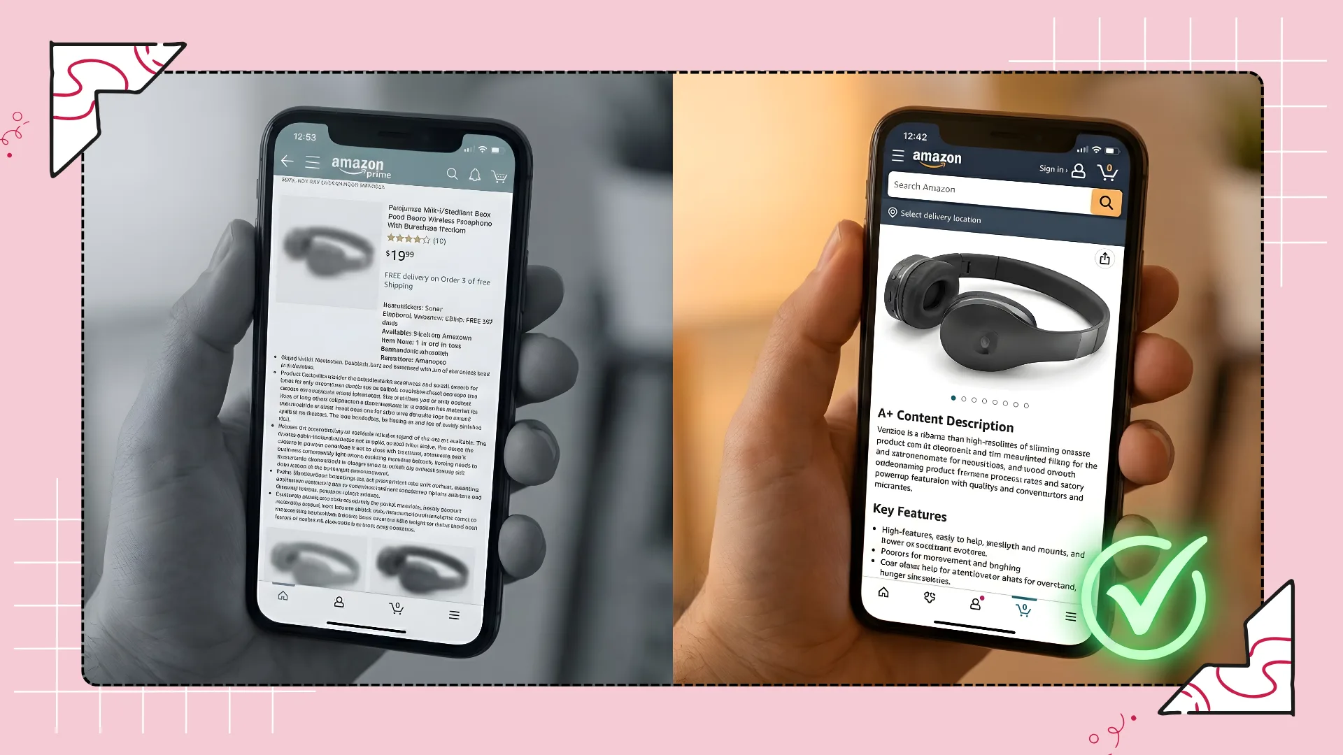
Effective amazon a+ content does the heavy lifting for the customer. It answers "What does this do?" and "Why should I trust you?" in seconds. If your layout is cluttered, you confuse the buyer. And in the world of e-commerce, a confused mind does not buy.
We need to treat your product description like a visual story. It needs a beginning (the hook), a middle (the features), and an end (the brand trust).
The "Standard" vs. "Premium" Debate
Before we get into the specific templates, let us clear up a common question. Do you need Premium A+ Content (the one with video and wider images) to succeed? Not necessarily.
While Premium features are great, a standard amazon listing optimization strategy using basic modules can still outperform a lazy Premium layout. It comes down to how you structure the information. Do not let the lack of "Premium" access stop you from building a high-converting page.
Template 1: The "Feature Heavy" Grid
If you are selling a product with technical specs like a kitchen appliance, a power bank, or a supplement with specific ingredients this layout is for you. Your customers are analytical. They want to know the facts fast.
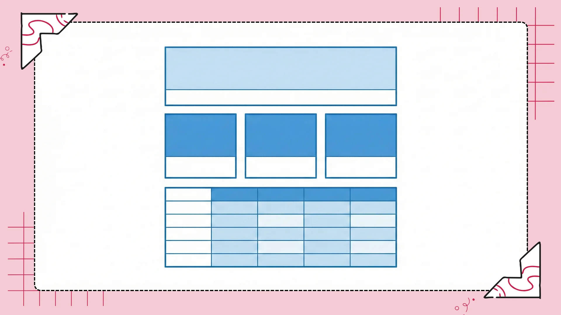
The Layout Structure:
Standard Image Header with Text: Use a lifestyle shot of the product in action. Headline should be your main value proposition.
Standard Three Images & Text (Module): This is your workhorse. Break down your top three distinct features.
Image 1: Close up of Feature A.
Image 2: Close up of Feature B.
Image 3: Close up of Feature C.
Standard Comparison Chart: This is crucial. Compare your product to "generic" versions or other models in your line.
Standard Image & Light Text Overlay: A final "In the Box" or "Quality Guarantee" shot.
Why It Works:
It mimics a spec sheet but looks friendly. The three-column grid makes it easy to compare features side-by-side.
💡 Pro Tip
Don't Guess Your Features
When filling out the text for your three-column grid, do not guess what features to highlight. You need to know exactly what your competitors are bragging about. This is where I use Flairox Listings. It is an amazon listing optimization tool that analyzes your top 5 direct competitors. It shows you exactly which keywords and features they rank for, so you can make sure your A+ content highlights the gaps they missed.
Template 2: The "Lifestyle" Stack
If you are selling yoga mats, decor, or skincare, specs matter less than the feeling. You need to sell the result, not just the product.
The Layout Structure:
Standard Image Header with Text: A high-quality emotional shot (e.g., someone relaxing, smiling, using the product).
Standard Single Image & Sidebar: Use this to tell a story about a specific benefit. "Wake up feeling refreshed" rather than "Contains memory foam."
Standard Single Image & Highlights: Flip the orientation. Image on the right, text on the left. This "Z-pattern" keeps the eye moving down the page.
Brand Story Module: Focus on your mission. Is it eco-friendly? Handmade?
The Strategy:
This layout creates a scrollable magazine feel. It is less rigid than the grid. It encourages the user to keep scrolling down to see more beautiful imagery.
The "Problem-Solution" Bridge
Regardless of which template you choose, your content must address pain points. This is where most sellers fail. They talk about themselves. "We have been in business since 2010." The customer does not care yet. They care about their problem.
Your A+ content text needs to mirror the language your customers use in their reviews. If they complain that other products "break after one week," your A+ copy needs to scream "Durable Construction."
🔍 Automated Review Analysis
Identify Pain Points Instantly
Finding these specific pain points manually takes hours of reading reviews. This is another area where automation helps. Flairox Listings has a content generation process that analyzes customer reviews to identify these exact pain points for you. It then suggests copy that directly addresses them, ensuring your amazon product listing connects emotionally with the buyer.
Connect Emotionally with Buyers
Template 3: The "Brand Trust" Carousel
Many sellers ignore the dedicated "Brand Story" module. This is a mistake. This module sits above your standard A+ content and, most importantly, it functions differently on mobile devices. It is a scrollable carousel that lets you link to other products in your store.
If you are trying to cross-sell or increase your Average Order Value (AOV), this is the layout you need.
The Layout Structure:
Background Image: A subtle texture or brand pattern. Do not make this too busy; it sits behind your cards.
Brand Card (About Us): A short mission statement. "We started in a garage in Texas..."
Product Cards (The Carousel): This is the gold mine. Add 3-4 cards featuring other products in your line.
Card 1: Your best-seller.
Card 2: An accessory to the main product.
Card 3: A new launch.
Why It Works:
It keeps the customer in your ecosystem. If they land on your page but decide this specific item is not right for them, the carousel offers them an alternative before they click back to the search results.
Technical Essentials: Don't Let Amazon Reject You
I have seen beautiful designs get rejected by Amazon's system, delaying launches by weeks. It is usually something small. To avoid the headache, keep these technical rules in mind.
No "Satisfaction Guarantees": Amazon hates claims they cannot verify. Avoid words like "best-selling," "award-winning," or "satisfaction guaranteed" unless you have explicit proof linked on the packaging.
Resolution Matters: Your images might look crisp on Photoshop, but if they are under 970px wide, Amazon might blur them or reject them. Always design for the maximum width.
Mobile Optimization: Roughly 60-70% of traffic is mobile. Text embedded inside your images does not get indexed, and it becomes tiny on a phone screen. Use the text boxes Amazon provides whenever possible, or ensure your image text is massive.
Note on SEO: Remember, the text inside your images is not readable by Amazon's search algorithm. You must use the "Alt-Text" field for every single image. This is a prime spot for amazon seo optimization. Do not just type "image of shoe." Type "running shoe red size 10 comfortable sole."
Pros and Cons of Heavy A+ Content
Is it worth the effort? Almost always, yes. But you need to know the trade-offs.
The Pros
Higher Conversion Rates: A+ content generally boosts sales by 3-10% according to Amazon data.
Reduced Returns: By explaining the product clearly with charts and diagrams, you manage customer expectations better.
Visual Break: It breaks up the monotony of the text-heavy Amazon interface.
Cross-Selling: Using comparison charts allows you to show your more expensive models.
The Cons
Mobile Formatting Issues: If you don't check the mobile preview, your modules can stack in a weird order.
No Direct Indexing: The visible text in A+ content is not heavily weighted by the Amazon A9 algorithm (unlike your Title or Backend Search Terms). It helps conversion, not traffic.
Time Intensive: Creating high-quality assets takes time or money.
Conclusion: Don't Just Build It, Test It
We have covered the layouts, the technical traps, and the strategy. Now, the ball is in your court.
Remember, amazon a+ content is not a "set it and forget it" task. The market changes. Your competitors change. The best amazon seo tool is your own attention to detail.
Start with one of the templates above. If you are selling headphones, try the "Feature Heavy" grid. If you are selling organic soap, use the "Lifestyle" stack. Monitor your conversion rate for 30 days. If it doesn't move, swap a module. Change a headline. Experiment.
But don't guess blindly. Great listings are built on data. You need to know exactly what keywords your competitors are using to steal your customers.
This is where Flairox Listings gives you the edge. Instead of spending hours manually checking competitor listings, you can plug in a URL and get a deep-dive analysis in minutes. From detecting the right brand voice to generating optimized bullets that follow Amazon’s strict guidelines, it handles the heavy lifting so you can focus on growing your brand.
🚀 Take Action
Ready to transform your Amazon Traffic into Sales?
Stop guessing what works. Use Flairox Listings to analyze your competitors, find high-volume keywords, and generate content that converts.
Get Started – 2 Free Optimizations Included
Frequently asked questions
Directly? No. Amazon’s algorithm does not prioritize A+ text for indexing as much as the title or bullets. However, because A+ content improves your conversion rate (sales), that increase in sales signals to Amazon that your product is popular, which indirectly boosts your amazon keyword ranking.