 Bilal Siddiqui
Creating a product listing is one thing; building a brand experience that converts is another. For Amazon sellers in competitive markets like the USA, UK, Canada, and Australia, Amazon A+ Content (formerly Enhanced Brand Content or EBC) is the lever that turns "browsers" into "buyers."
Data shows that well-optimized A+ Content can increase sales by 5% to 20%. However, a poor design with pixelated images or cluttered text can actually hurt your conversion rate.
This guide provides a strict, actionable framework for 2025. We will cover exact Amazon A+ content image sizes, text constraints, and the design rules successful brands use to dominate the SERPs.
A+ Content Goals: CRO, Clarity & Trust
Before you open Photoshop or Canva, you must understand why you are building this. A+ Content is not just "pretty pictures"; it is a conversion rate optimization (CRO) tool designed to do three things:
CRO (Conversion Rate Optimization): It keeps the user on the page longer. The more they scroll, the more likely they are to buy.
Visual Clarity: It breaks down complex features. If you sell a supplement, A+ Content explains the ingredients. If you sell a gadget, it visualizes the setup.
Brand Trust: It signals legitimacy. A generic listing looks risky; a branded listing with a "Brand Story" and consistent fonts looks like a safe purchase.
Pro Tip: Think of your A+ Content as a "mini-landing page" inside Amazon. Its only job is to overcome objections that the bullet points didn't answer.
Image Specs Checklist
One of the most common reasons for Amazon A+ rejection (or poor performance) is improper formatting. Use this checklist to ensure your creative assets are compliant and high-definition.
1. File Types & Limits
Accepted Formats: JPG (Recommended), PNG, BMP.
Note: Avoid PNGs for huge photos as they slow down load times; use compressed JPGs for photos and PNGs for graphics with flat colors.
Max File Size: 2 MB per image (aim for under 500KB for faster mobile loading).
Color Space: RGB (Standard for web). Do not use CMYK (Print); it will look neon or washed out on screens.
2. Resolution & The "Hi-Res" Mindset
Amazon requires a minimum resolution of 72 DPI, but this is often too low for modern Retina displays (iPhones/Macs).
Draft at 2x Scale: If a module asks for 970px width, design your source file at 1940px width and export it down. This ensures your text and icons remain crisp on high-density mobile screens.
Avoid Pixelation: Never stretch a small image to fit a larger module. If your product photo is blurry, customers assume your product quality is also low.
3. Text in Images
Do not bake small text into images. On a desktop, it looks fine. On a mobile phone, that 970px wide banner shrinks to the size of a postage stamp.
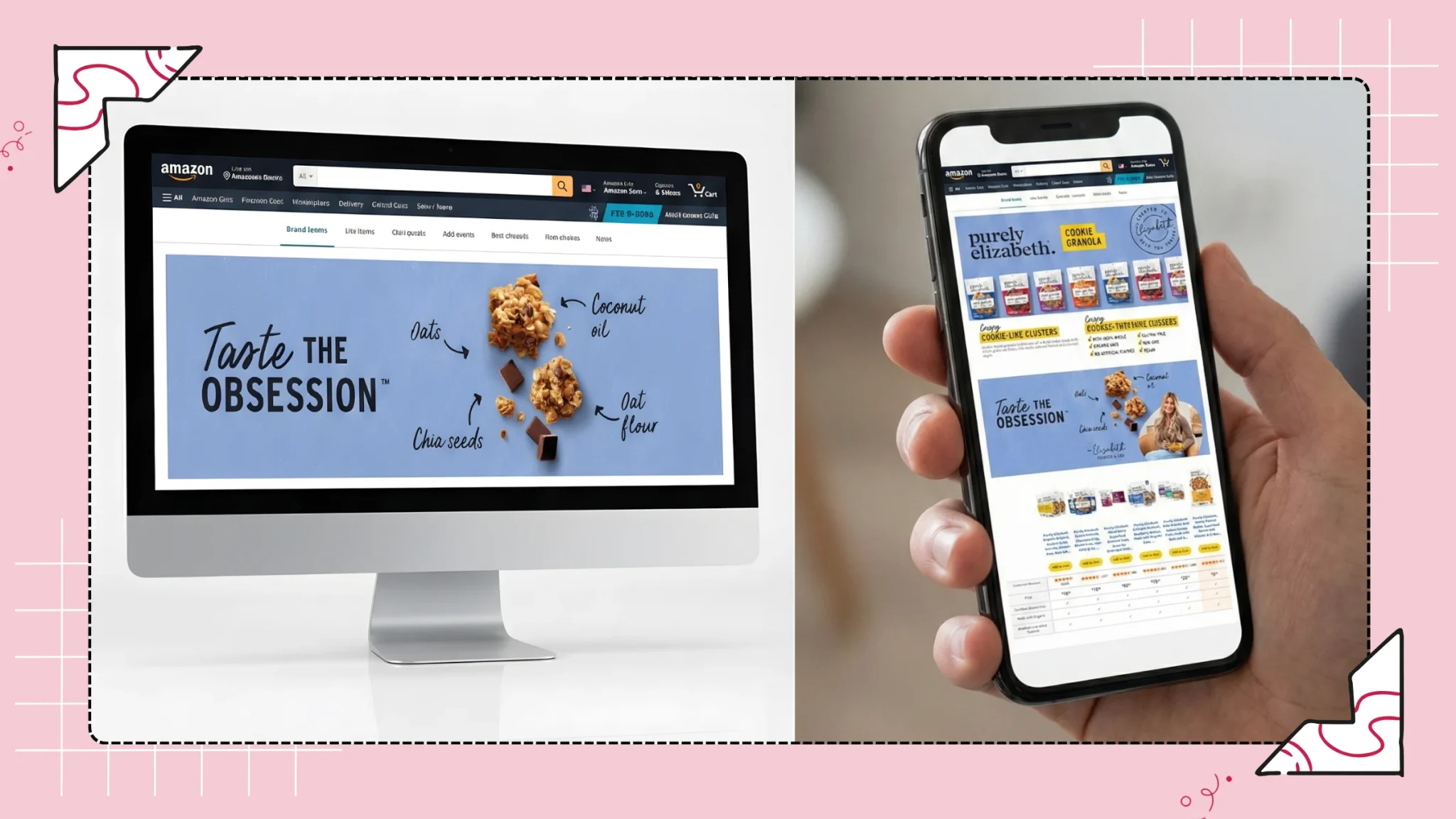
Rule of Thumb: If you put text on an image, use a font size of at least 30pt (relative to the image size) so it remains readable on mobile.
Common Module Dimensions
Amazon offers roughly 17 "Basic" modules and many more "Premium" modules. However, you should stick to the top 5 most effective modules to maintain a clean look.
Note: Dimensions below are Width x Height in pixels.
1. Standard Company Logo
Size: 600 x 180 px
Usage: Usually sits at the very top. Keep it clean; do not add taglines here.
2. Standard Image Header with Text (The "Hero" Banner)
Size: 970 x 600 px
Usage: This is your big lifestyle shot.
Safe Zone: Avoid putting faces or text in the bottom 20% of this image, as Amazon sometimes overlays text or navigation arrows depending on the device.
3. Standard Three Images & Text
Size: 300 x 300 px (per image)
Usage: Perfect for highlighting three distinct features (e.g., "Waterproof," "Durable," "Lightweight").
Mobile Behavior: These stack vertically on mobile. Ensure the order makes sense when read top-to-bottom.
4. Standard Comparison Chart
Size: 150 x 300 px (per product image)
Usage: Critical for upselling. Compare your product to your own other products (not competitors). This keeps buyers in your ecosystem.
5. Premium Full-Width Image
Size: 1464 x 600 px
Usage: Available only if you have Premium A+ Access. This spans the entire screen width and offers a much more immersive "Apple-style" experience.
Warning: Module sizes vary slightly by template. Always double-check the "Upload" window in Seller Central for the exact pixel requirement of the specific module you selected.
Copy Length Rules
A common mistake among Amazon sellers is treating A+ Content like a blog post. It is not a blog; it is a brochure.
Balance Text vs. Visuals
Amazon shoppers are skimmers. They look for keywords and images that confirm they are making the right choice.
The 70/30 Rule: Your A+ Content should be roughly 70% visual and 30% text.
Avoid "Walls of Text": Paragraphs should never exceed 3–4 lines. If a feature needs more explanation, break it into bullet points.
Character Limits & Indexing
Each module has strict character limits (often 150–500 characters per text block).
Don't Max Out Limits: Just because you can use 500 characters doesn't mean you should. A concise 200-character description is often more effective.
SEO Reality Check: While Amazon’s A9 algorithm prioritizes your Title and Backend Keywords, Google indexes A+ text. This means you should write naturally for humans but include your target keywords (like "organic dog treats" or "ergonomic office chair") for external search traffic.
Important: Amazon does not index text within A+ Content modules for keyword purposes. All keyword indexing comes from your title, bullets, description, and backend search terms — make sure your backend keywords are fully optimised alongside your A+ content.
Flairox Listings
Create Better A+ Content Without a Separate Design Tool
Generate product images and A+ Content alongside your titles, bullet points and descriptions, keeping your entire Amazon listing consistent in one workspace.
Design Rules That Improve Conversion
To compete in the US or UK markets, your design must look professional. A DIY look can kill trust instantly.
1. One Message Per Module
Don't try to cram every feature into one banner.
Module 1: Focus on the main benefit (e.g., "Sleep Better").
Module 2: Focus on the ingredients/tech (e.g., "Memory Foam Layer").
Module 3: Focus on the lifestyle (e.g., "Wake up refreshed"). When you separate messages, you reduce cognitive load, making it easier for the customer to say "yes."
2. Strong Visual Hierarchy
Guide the customer’s eye.
Headings: Use the module headers for your primary benefit statement.
Body Text: Use for supporting details.
Callouts: Use bold text or icons to highlight specs like "BPA Free" or "2-Year Warranty."
3. Consistent Typography & Icons
Your A+ Content must match your product packaging and your main image listing.
If your packaging uses a minimalist sans-serif font, do not use a decorative script font in your A+ banners.
Use a consistent icon style. Don't mix 3D clip-art with flat line icons. Stick to one style pack (e.g., flat, monochrome black).
What to Include
If you are unsure which modules to pick, these four are the highest converting "blocks" for 2025:
1. The "Feature-Benefit" Block
Don't just list features; list benefits.
Feature: "Double-wall insulation."
Benefit: "Keeps your coffee hot for 12 hours." Use the Standard 3-Image with Text module for this.
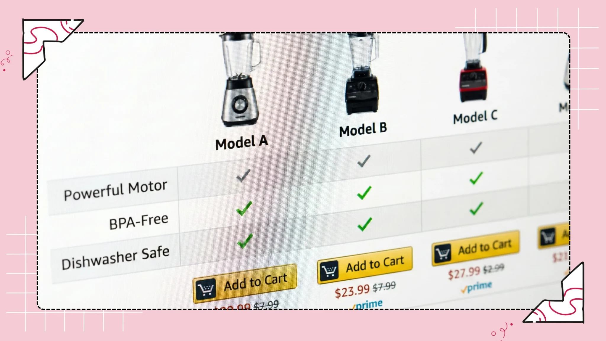
2. The Comparison Chart
This is arguably the most powerful module.
Upsell Strategy: Compare the model the customer is looking at with a more expensive version you sell. Show that for just $10 more, they get extra features.
Traffic Defense: If you don't provide a comparison chart, Amazon might show a "Sponsored Products" row from your competitors right below your description. Own that real estate.
3. "What’s In The Box"
For electronics, toys, or multi-part sets, returns often happen because the customer thought something was included that wasn't (e.g., batteries).
Create a simple visual or list showing exactly what arrives in the package. This drastically reduces negative reviews and returns.
4. Brand Story
This is a separate section that appears above the A+ description. It allows you to link to your Amazon Brand Store. Always set this up—it’s free traffic to your catalog.
What to Avoid (Policy + Performance)
Amazon’s manual approval process is strict. Violating these rules will lead to rejection (rejection usually takes 2-7 days, wasting precious time).
1. Forbidden Words & Claims
Amazon does not allow promotional or subjective claims in A+ Content.
Avoid: "Best Seller," "Top Rated," "cheapest," "bonus," "free," "buy now."
Guarantees: You cannot say "100% Satisfaction Guarantee" or "Money Back Guarantee." This is an immediate rejection trigger.
Eco-Claims: Words like "Eco-friendly," "Green," or "Biodegradable" now require proof and specific certifications to be uploaded to Amazon’s Climate Pledge Friendly program.
2. Competitor Bashing
You cannot mention competitors by name (e.g., "Better than Sony"). You can compare against "Generic brands" or "Standard models," but keep it vague.
3. Review Snippets
Do not screenshot positive customer reviews and put them in your images. Customer data is private, and Amazon wants reviews to stay in the review section, not the description.
A+ QA Checklist Before Publishing
Before you hit "Submit" in Seller Central, run this final audit:
Mobile Preview: Toggle the "Mobile" view in the A+ manager. Is the text on your banners readable? If not, remove the text or make it bigger.
Alt-Text: Did you add descriptive Alt-Text to every image? (e.g., "Woman running with bluetooth headphones"). This is crucial for accessibility and SEO.
Spelling & Grammar: Amazon can reject content for typos. It looks unprofessional.
ASIN Assignment: Did you apply the content to all child variations (sizes/colors)?
Image Quality: Are any images pixelated? If yes, replace them.
Quick Checklist/Summary
Step 1: Ensure you are Brand Registered on Amazon.
Step 2: Plan your "Story." Choose 4-5 modules (Hero, Features, Lifestyle, Comparison).
Step 3: Design images at 2x resolution (e.g., 1940px width for a 970px banner).
Step 4: Write concise copy with SEO keywords, focusing on benefits over features.
Step 5: Upload to Seller Central, add Alt-Text, and apply ASINs.
Step 6: Monitor your Conversion Rate (Unit Session Percentage) for 30 days after publishing to measure impact.
Frequently asked questions
Indirectly, yes. Amazon’s A9 algorithm focuses on sales velocity and conversion rate. Because A+ Content improves conversion rates (turning more clicks into sales), your product will naturally rank higher over time. Additionally, Google does index the text in A+ content, helping you appear in Google search results.