 Bilal Siddiqui
Key takeaways
Fill every slot: listings with 7+ images convert far better, so use all nine and give each a distinct job.
Order beats count. Front-load your strongest objection-killers, because mobile shoppers rarely swipe to the end.
Mix image types: infographics, lifestyle, scale, comparison, packaging, and variation shots, plus a gallery video where possible.
Design mobile-first (large text, one message per image) and keep secondary images truthful to stay compliant.
Most sellers pour their energy into the main image, get it approved, and then treat the rest of the gallery as an afterthought. A couple of extra angles, maybe a stock lifestyle photo, and the job feels done.
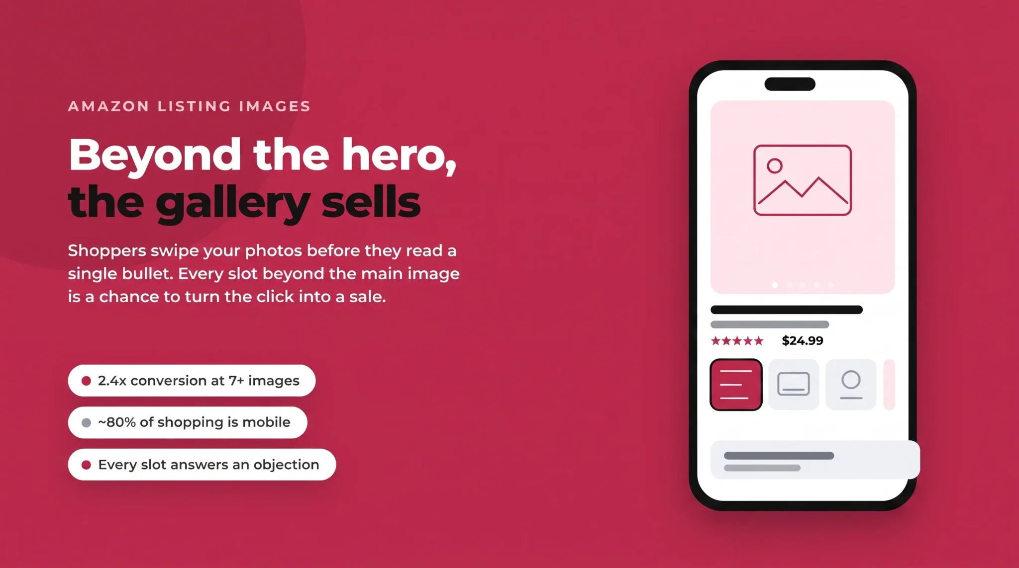
That's a costly habit. Nearly 80% of Amazon shopping now happens on a phone, where the image gallery is the entire buying experience. Shoppers swipe through your photos before they read a single bullet point, and often decide to buy or bounce without scrolling any further. Your secondary Amazon listing images are where the click turns into a sale, or doesn't.
This guide is a complete blueprint for everything after the hero shot: how to structure and order your gallery, which secondary image types actually convert, how to use video, how to design for mobile, and how to stay compliant with Amazon's tightening image rules. (For the main image itself, which follows its own strict rules, see our dedicated guide linked below.)
Why Your Amazon Listing Images Beyond the Main Photo Matter
The main image earns the click in search. The rest of the gallery earns the sale on the product page, and the difference is measurable. Listings with seven or more images have been found to convert at roughly 2.4 times the rate of single-image listings, and galleries that use all available slots consistently outperform those that leave slots empty.
There's a simple reason for that. Every additional image is a chance to answer an objection. Is it the right size? Will it fit my space? What's actually in the box? How does it compare to the cheaper option next to it? A shopper who can't answer those questions from your photos will either message you, guess, or click away to a competitor who made it obvious.
The gallery also feeds the same flywheel that governs your Amazon click through rate: stronger images lift conversion, conversion lifts sales velocity and organic rank, and better rank brings more impressions. Images sit at the very front of that loop, which is why they are one of the highest-return things you can improve on a listing.
Amazon Image Requirements and Specs (Quick Reference)
Before strategy, get the technical foundation right. Amazon rejects or suppresses images that break its specs, so treat this as your pre-flight checklist. These requirements apply to your product images across the listing.
Requirement | Specification |
|---|---|
Minimum size | 1,000 px on the longest side (required for zoom) |
Recommended size | 2,000–3,000 px on the longest side |
Maximum size | 10,000 px on the longest side |
Aspect ratio | 1:1 square strongly recommended |
File formats | JPEG (preferred), PNG, TIFF, non-animated GIF |
Maximum file size | 10 MB per image |
Colour space | sRGB (not CMYK, which shifts colour on browsers) |
A few of these matter more than sellers realise. The 1,000-pixel minimum is what unlocks hover-to-zoom, and shoppers use zoom to inspect texture and quality before buying, so anything smaller quietly hurts conversion. Saving in CMYK instead of sRGB can make your carefully chosen colours look washed out or off in the browser. And a true 1:1 square keeps your images from being awkwardly cropped as they move between desktop and mobile layouts.
Main Image vs. Secondary Image Rules
Your main (hero) image lives under strict rules: a pure white background, the product filling around 85% of the frame, and no text, logos, badges, or graphics. Because that image is its own discipline, we won't repeat it here. Read our full Amazon main image optimization guide for how to nail slot one.
Secondary images (slots two onward) are where you get creative freedom. They can use any background, and you can add text callouts, infographics, lifestyle scenes, props, and comparison graphics. This is the space this guide focuses on, because it's where most of your selling actually happens.
How Many Images You Get
Most listings allow up to nine images, but only seven display by default on desktop before the shopper has to click "see more." On mobile, the carousel is the star of the page. The practical takeaway: fill every slot. An empty slot is a wasted chance to close an objection, and the data is clear that fuller galleries convert better. Plan for at least seven strong images, and use eight and nine for social proof, guarantees, or variation coverage.
The Ideal Amazon Image Gallery Structure and Order
A gallery isn't a pile of photos; it's a sequence that walks a shopper from curiosity to confidence. Because mobile shoppers rarely swipe to the very end, you want your most persuasive images early. Here's a proven slot-by-slot structure to adapt to your product:
Slot | Image purpose | Job it does |
|---|---|---|
1 | Main / hero image (white background) | Earns the click in search |
2 | Lead feature or benefit infographic | States your single strongest reason to buy |
3 | Lifestyle / in-use shot | Shows the product in real context |
4 | Scale and size reference | Answers "will it fit / how big is it?" |
5 | Feature callouts / close-up detail | Proves quality and specifics |
6 | Comparison or "why us" image | Wins the shopper still weighing options |
7 | Packaging / what's in the box | Sets delivery expectations |
8–9 | Social proof, guarantees, variations | Removes final doubt |
Why Order Beats Count
Filling nine slots does nothing if your best image is buried at position eight. The first two or three secondary images do the heavy lifting, especially on mobile where they're what shows in the thumbnail strip. Front-load the images that kill the biggest objection or communicate the clearest benefit, and treat the later slots as reinforcement. Think of it as a story with the punchline near the front, not the end.
The Secondary Image Types That Convert
Each image in your gallery should do one job and do it clearly. Repeating the same information across three photos wastes slots; a spread of purposeful image types covers more of the shopper's questions.
Feature and Benefit Infographics
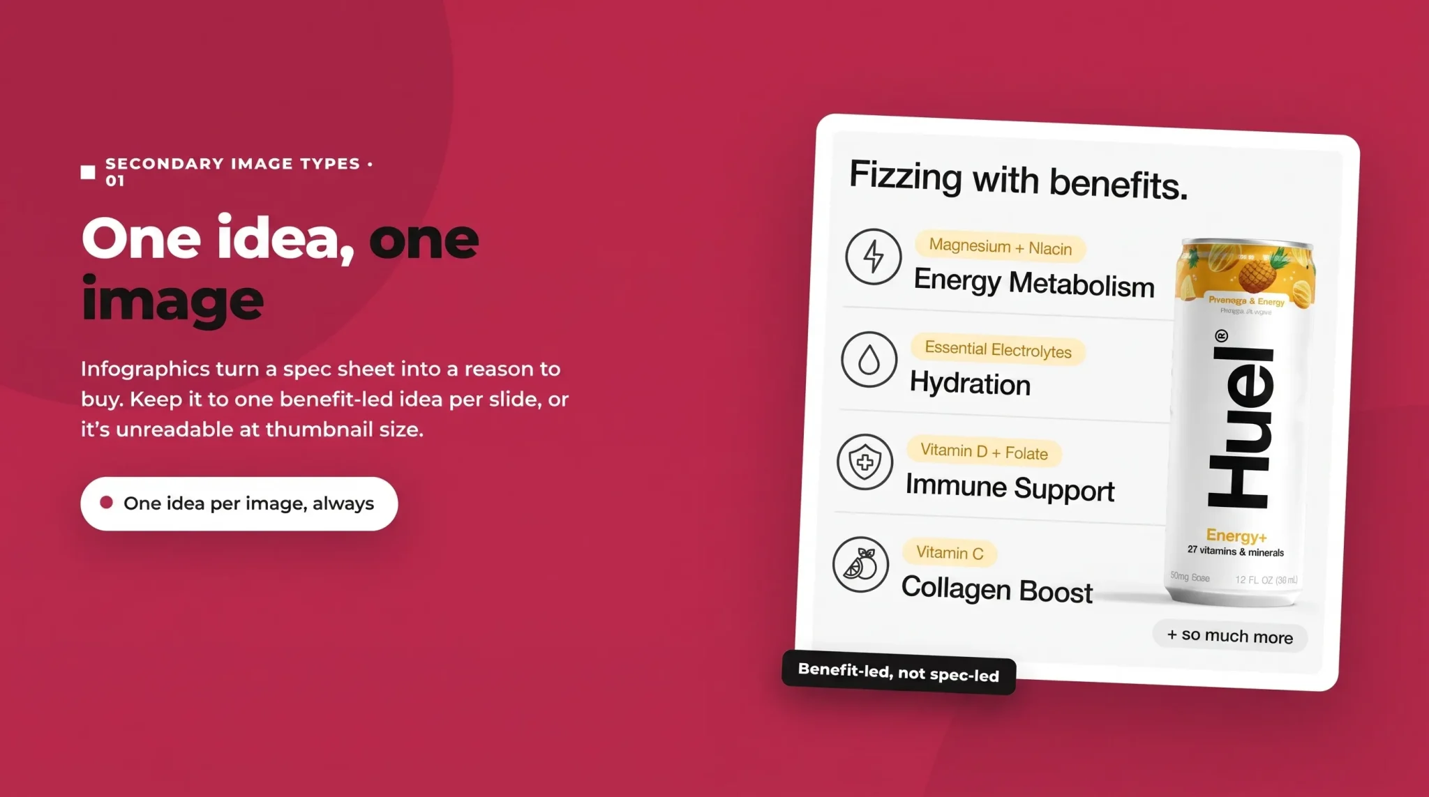
Infographics turn dry specifications into reasons to buy. Rather than stating "600ml capacity," an infographic shows the bottle next to a day's worth of hydration with a short, benefit-led caption. The golden rule is one idea per image. Cramming five features onto one graphic makes all of them unreadable at thumbnail size. Keep the text short, the hierarchy obvious, and the benefit (not just the feature) front and centre.
Lifestyle Images
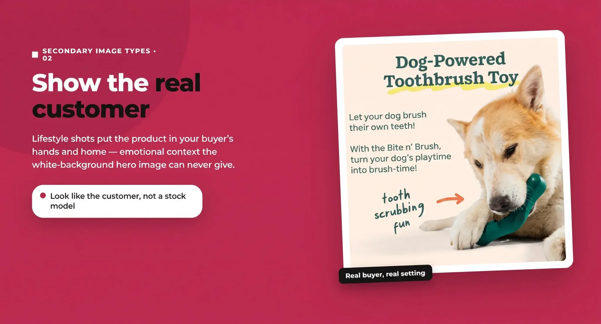
Lifestyle photography shows your product in the environment and hands of your target buyer, which helps shoppers picture themselves owning it. The most effective lifestyle shots look like your actual customer, not a generic stock model. If you sell to busy parents, show a busy parent's kitchen, not a sterile studio set. This emotional context is something the white-background main image can never provide, which is exactly why it belongs early in the gallery.
Product Scale and Size Images
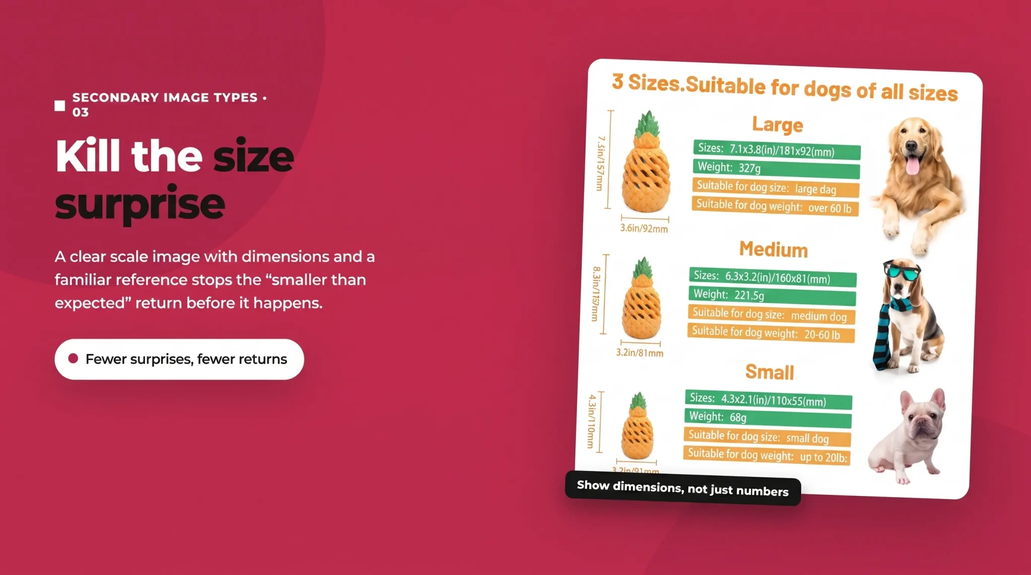
Size uncertainty is one of the biggest drivers of returns and disappointed reviews. A scale image, showing the product in a hand, on a desk, or in a room, prevents the "smaller than expected" problem before it happens. Include clear dimensions, and where useful, show the product next to a familiar reference object. Fewer surprises on arrival means fewer returns and better review scores.
Comparison Images
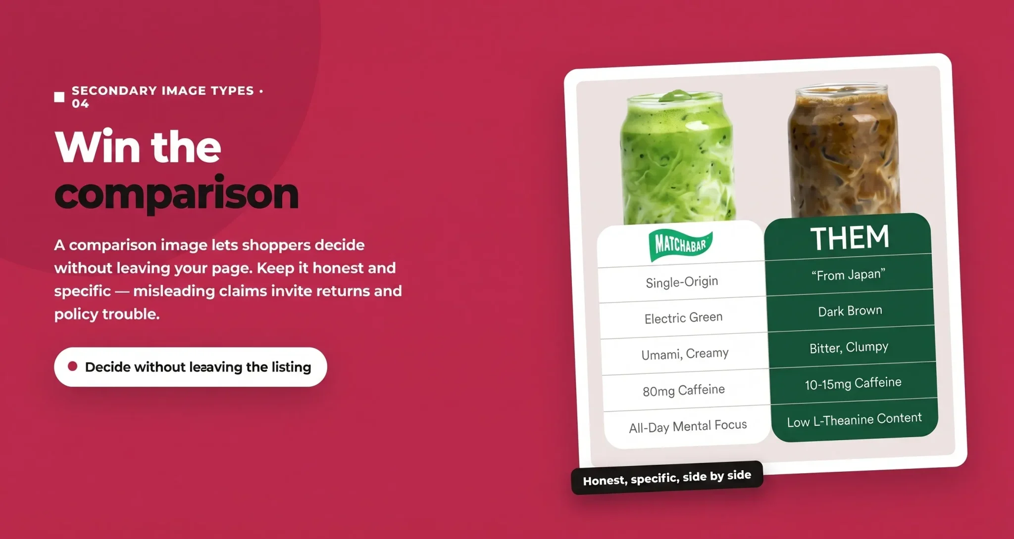
Many shoppers are still comparing options when they land on your page. A comparison image lets them make the decision without leaving your listing. You can compare against generic alternatives ("ours vs. the cheap version") or across your own product range to guide them to the right variant. Keep comparisons honest and specific; misleading claims invite both returns and policy trouble.
Packaging and What's-in-the-Box Images
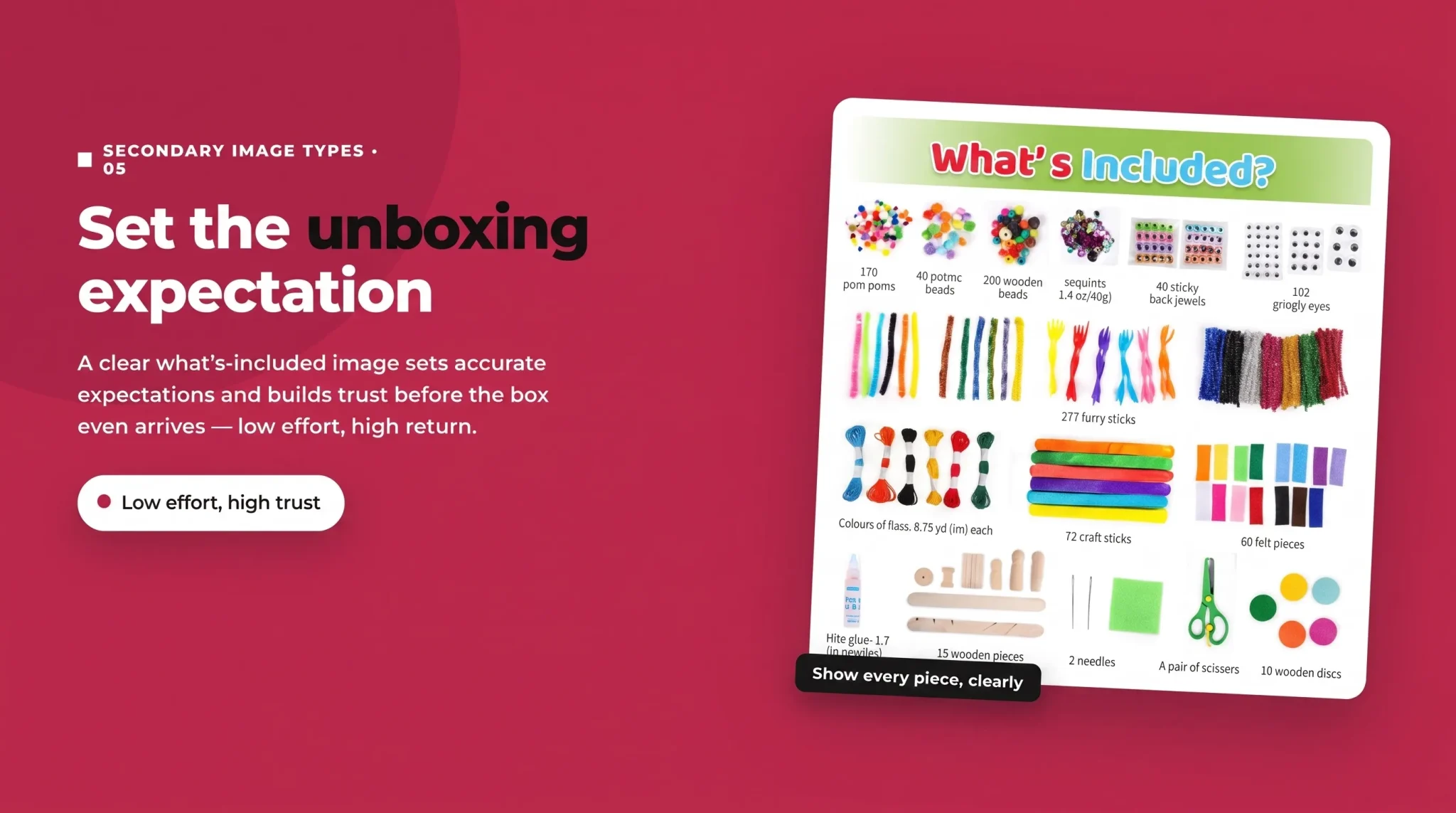
A clear "what's included" image sets accurate expectations for the unboxing and reassures buyers they're getting everything they expect. For products bought as gifts, attractive packaging shots also signal gift-worthiness, which can tip a purchase decision. This is a low-effort, high-trust image that too many sellers skip.
Variation Images
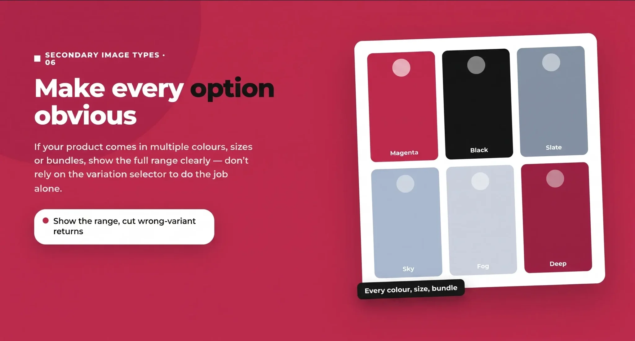
If your product comes in multiple colours, sizes, or bundles, your gallery should make those options obvious. Clear variation images reduce confusion, help shoppers choose the right version quickly, and cut down on wrong-variant returns. Show the full range cleanly rather than assuming the variation selector alone does the job.
Add Video and 360 Spins to Your Gallery
Video is no longer optional at the top of the market. Listings with at least one video in the main image carousel have been found to convert roughly 8–14% better than those without. The carousel video (sitting among slots two to seven) is the most valuable spot because it auto-plays as shoppers swipe on mobile, and it's often the only video most shoppers ever watch.
A strong gallery video does in motion what your images do in stills: shows the product in use, demonstrates scale, and answers a key objection in the first few seconds. Keep it short and front-load the payoff, because attention drops fast.
A note on 360-degree spins: Amazon currently allows only vendors to submit true interactive 360 spins directly, but sellers can capture a spin and upload it as a video to get much of the same "examine it from every angle" benefit. Either way, motion content reduces uncertainty, and less uncertainty means fewer returns.
How Your Image Gallery Works With A+ Content
Your gallery and your A+ Content are partners, not duplicates. The gallery is the shopper's first and most-seen visual experience, sitting at the top of the page and dominating mobile. A+ Content lives further down the page and is the place for deeper brand storytelling, richer comparison tables, and additional lifestyle imagery.
The mistake to avoid is repeating the same images and messages in both. Use the gallery to close the sale fast with your strongest objection-killers, and use A+ Content to expand on brand story, cross-sell your range, and reinforce trust for shoppers who scroll for more detail. Together they should feel like one coherent narrative, not the same six images shown twice.
Designing Amazon Images for Mobile Readability and CTR
Here's the uncomfortable truth: most Amazon browsing happens on mobile, yet most sellers still design images for a desktop monitor. An infographic that reads perfectly on a 27-inch screen can be illegible as a thumbnail on a phone.
Design mobile-first with a few rules. Make text large enough to read at thumbnail size, and test by shrinking your image on your own phone before you upload it. Use high contrast between text and background so captions don't disappear. Stick to one message per image so nothing competes for attention. Leave safe margins so nothing important gets cropped. And review your whole gallery on an actual phone, in the carousel, the way a real shopper will see it. If you can't understand an image in a two-second glance on a small screen, neither can your buyer.
Image Quality and Photography Planning
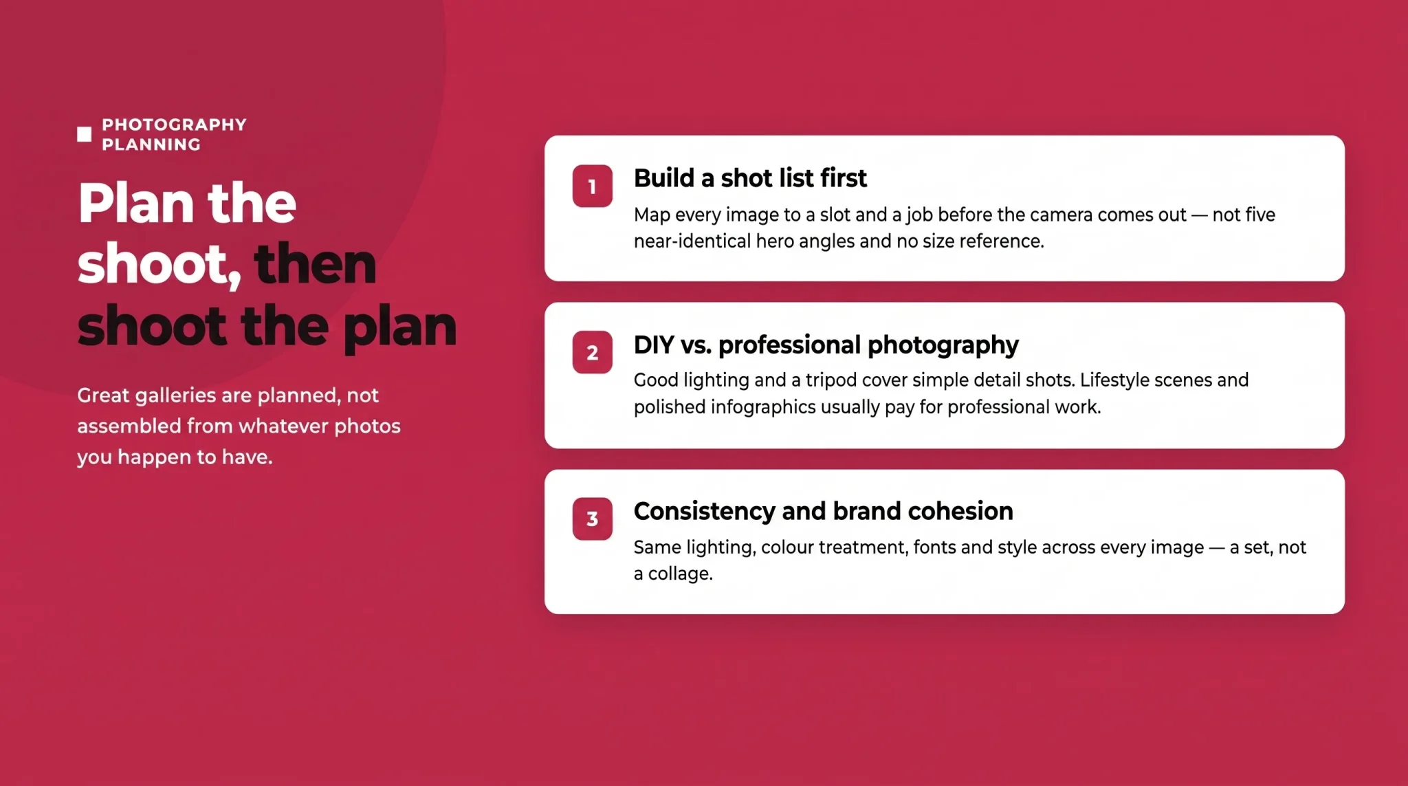
Great galleries are planned, not assembled from whatever photos you happen to have.
Build a Shot List Before You Shoot
Map every planned image to a slot and a job before the camera comes out. Decide which infographic goes in slot two, which lifestyle scene in slot three, what the scale shot needs to show, and so on. A shot list means you leave the shoot with a complete, purposeful gallery instead of five near-identical hero angles and no size reference.
DIY vs. Professional Photography
For simple products, a clean DIY setup with good lighting, a tripod, and a seamless background can produce solid main and detail shots. But lifestyle scenes, polished infographics, and category-competitive galleries usually pay for professional work, because the production quality directly influences perceived product quality. Weigh the cost against your price point and competition: in a crowded, premium category, amateur images will cost you more in lost sales than professional ones cost to produce.
Consistency and Brand Cohesion
Your gallery should look like a set, not a collage. Consistent lighting, colour treatment, fonts, and graphic style across all images signal that you're an established brand, which builds trust. A cohesive gallery also makes your listing instantly recognisable if a shopper sees your products more than once.
Staying Compliant With Amazon's Image Policies
Amazon has been steadily tightening image enforcement, and in 2026 much of the review is automated. Non-compliant images can be suppressed or can get a listing taken down, so compliance is not optional.
The main image rules are the strictest (pure white background, no text or badges), which is another reason to treat it separately. On secondary images you have more freedom, but not unlimited freedom. Informational overlays and infographics are fine, but keep claims truthful and clearly supportable. Avoid inventing Amazon-style badges such as "Amazon's Choice," "Best Seller," or lookalike graphics, and steer clear of misleading or unverifiable claims. As automated scanning tightens, the safest gallery is one that's persuasive and honest, so build trust rather than gaming it.
Common Amazon Image Mistakes and Troubleshooting
A few recurring problems quietly cost sellers conversions:
Low-resolution or blurry uploads that fail to trigger zoom or look cheap on retina screens.
Text too small for mobile, the single most common gallery mistake.
Empty slots that leave objections unanswered.
Inconsistent style across images that makes a brand look improvised.
Ignoring category rules, which can get images rejected.
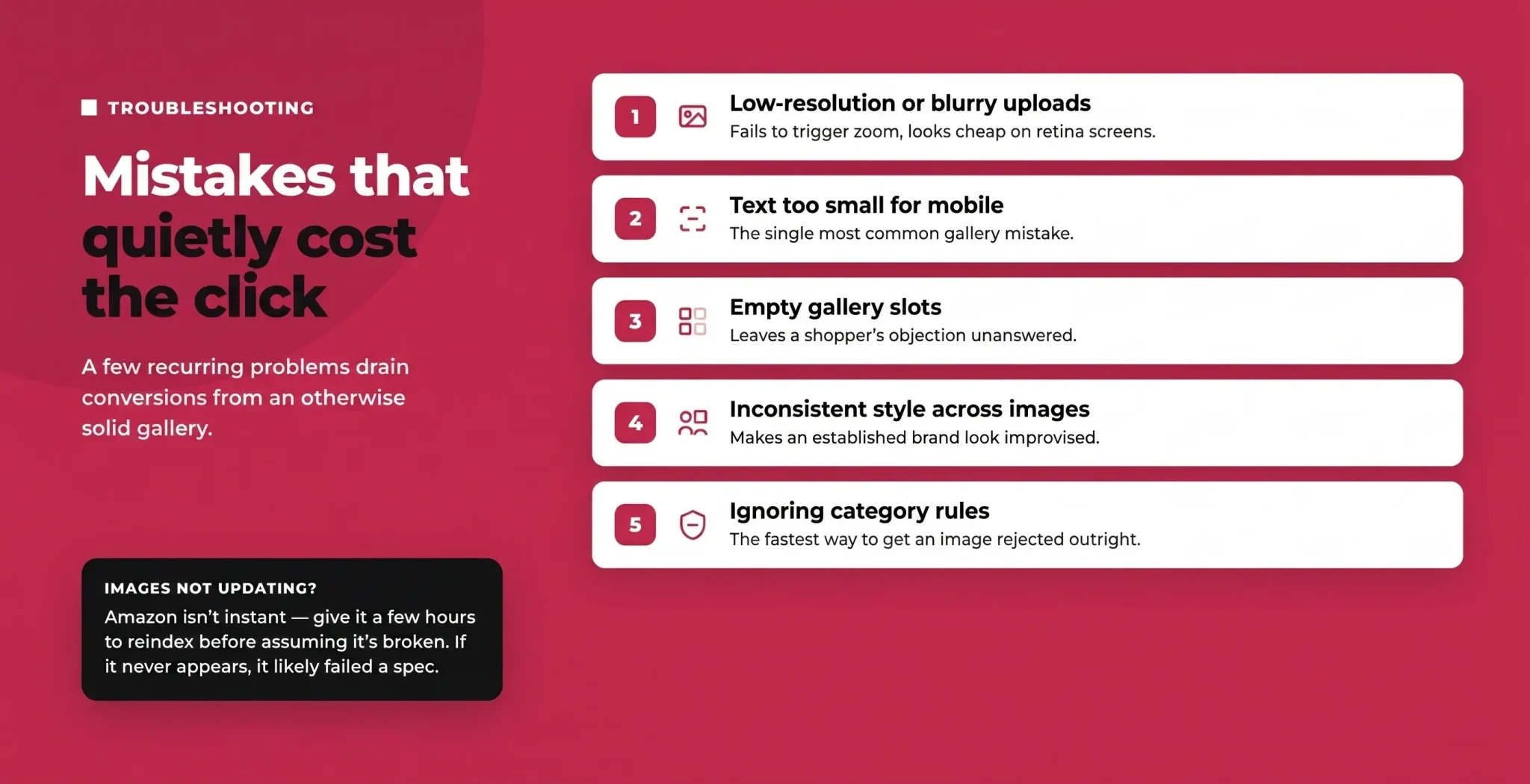
If your images aren't showing or updating: Amazon processing isn't instant, so new or swapped images can take time to appear while the system reindexes. Clear your cache and check back after a few hours before assuming something's broken. If an image never appears, it usually violated a spec (wrong format, too small, or a compliance issue) and was rejected. Following a consistent file naming convention tied to your SKU or ASIN also helps keep uploads organised and prevents the wrong image landing on the wrong listing.
Category-Specific Image Requirements
Beyond the universal specs, some categories add their own rules. Apparel, for example, often expects specific model or flat-lay shots and particular angles, and other categories have their own norms and exceptions. Before you plan a shoot, check the image guidelines for your specific category so you don't build a gallery that gets partially rejected. When in doubt, follow the stricter interpretation.
Turning Your Gallery Into a Conversion Engine
Your Amazon listing images are not a formality to clear before publishing; they're one of the most powerful conversion tools you have. Fill every slot with a purpose, order the gallery so your strongest images come first, design every image to read at thumbnail size on a phone, and back it all with video where you can. Do that, and your gallery will answer objections and close sales around the clock, without you touching your ad budget.
If your listings are getting clicks but your gallery isn't sealing the deal, that's exactly what we fix. Flairox Listings builds conversion-focused image galleries, from lifestyles images to infographics and mobile-first design, that turn browsers into buyers.
Frequently asked questions
Most listings allow up to nine images, though only seven show by default on desktop. Fill every slot you can, since fuller galleries consistently convert better.